Visualizing Seattle’s Tree Canopy
A data analysis of urban tree canopy change (2016–2021) and its relationship to race and health.
I consider myself a city person with a strong appreciation for nature and the role urban tree canopy plays in the health and livability of a city. I began this analysis to better understand how Seattle—and different communities within it—are doing in this regard.
What Is an Urban Tree Canopy—and Why It Matters
Urban tree canopy is defined as the layer of leaves, branches, and stems of trees that cover the ground when viewed from above1. Beyond being pretty, it provides significant environmental benefits in urban areas.
- Pollution Removal: Trees absorb pollutants such as carbon dioxide, ozone, and particulate matter, improving air quality.
- Heat Alleviation: Tree shade and evapotranspiration (moisture release) help reduce urban temperatures and mitigate the urban 'heat island' effect.
- Support for Wildlife: Urban canopies provide habitat for birds, insects, and other wildlife, supporting biodiversity.
Why Tree Canopy Matters for People
These environmental benefits translate into measurable social and health advantages for urban communities2, including:
- Better Mental and Physical Health: Access to green spaces has been linked to reduced stress, improved mood, and increased physical activity.
- Increased Property Values: Properties in well-treed areas often have higher market values due to the aesthetic and environmental benefits provided by the canopy.
- Reduction in Crime: Some studies suggest that greener neighborhoods experience lower crime rates and tend to have reduced rates of less graffiti, vandalism, and litter.
With those benefits in mind, the overall trend in Seattle’s tree canopy is concerning:
…the city as a whole losing roughly 0.4% of its canopy, equating to about 250 acres.
A Closer Look at the Data
My hometown of Seattle, Washington provides data on tree canopy changes for two periods: 2016 and 2021. The University of Vermont’s Spatial Analysis Lab (SAL) mapped these changes using high-resolution remote sensing data. More information, a detailed description of the mapping process, and the full dataset are available on the City of Seattle’s website3.
I combined this dataset with US Census data, allowing comparisons between canopy percentage and demographic factors such as race and health. This analysis can reveal how changes in tree canopy may be affecting different communities and their well-being.
The City of Seattle also published a final assessment of the data as a PDF: 2021 Tree Canopy Assessment.
How the Analysis Was Done
I downloaded the tree canopy data as an Excel file and joined it with a KML file (a format used for mapping geographic data) of Seattle. The data is organized by census tract, which provides a more detailed view than neighborhoods or ZIP codes and aligns neatly with supporting Census data. I combined, analyzed, and visualized the dataset using Tableau.
In Tableau, I created a dashboard highlighting areas of interest. During validation, I discovered that census tract 246 was missing key data points, so it is excluded from certain views to ensure the accuracy and reliability of the analysis.
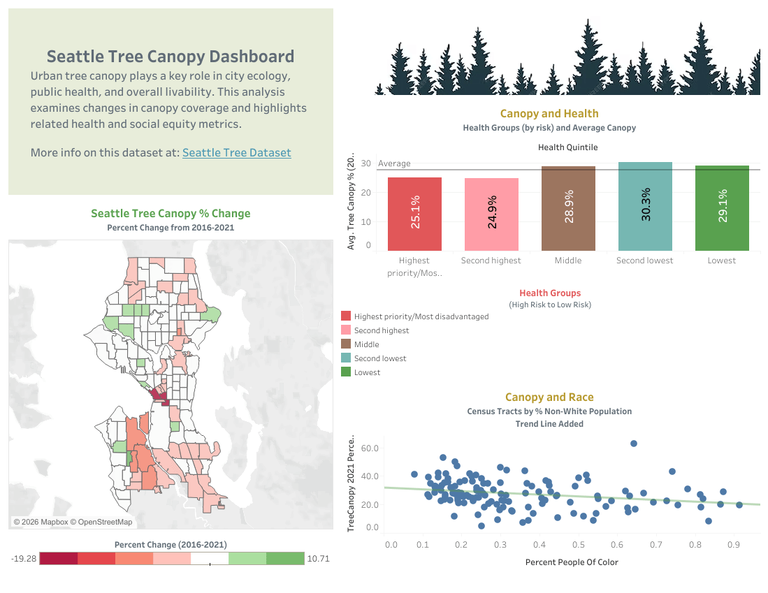
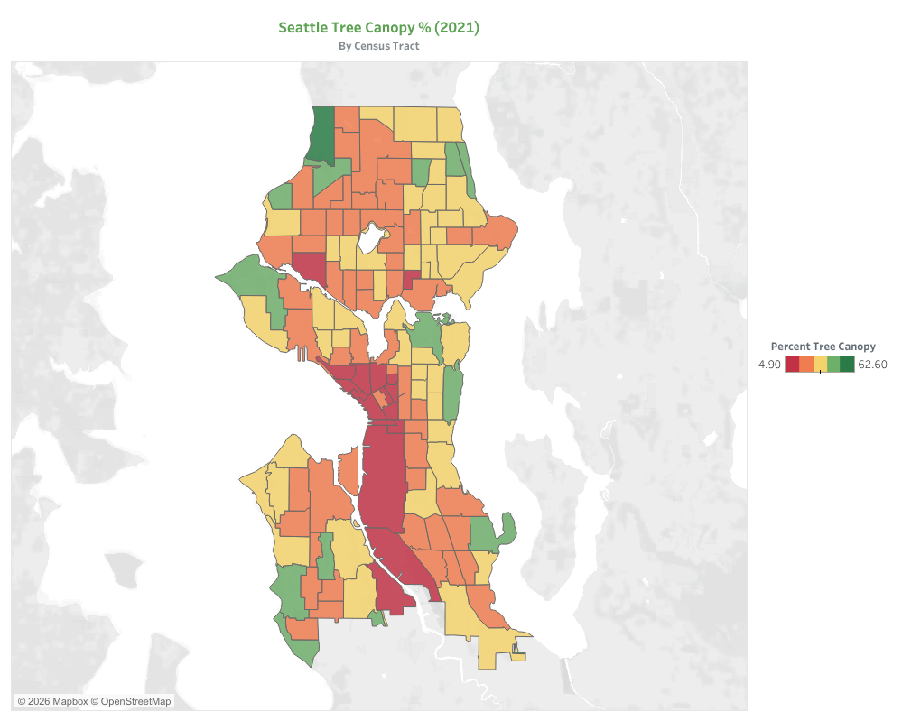
Visualizing Seattle’s Tree Canopy
The map below shows Seattle’s tree canopy by census tract in 2021, with green indicating high coverage, yellow moderate, and red minimal coverage.
The color distribution matches expectations: the downtown core and industrial districts south of downtown appear deep red, reflecting sparse tree coverage. In contrast, neighborhoods with large parks, such as Discovery Park, Seward Park, and the Washington Park Arboretum, are bright green, highlighting dense canopy areas.
This map not only illustrates the current state of the city’s canopy but also sets the stage for analyzing how these patterns relate to demographics and changes over time.
Changes in Canopy (2016–2021)
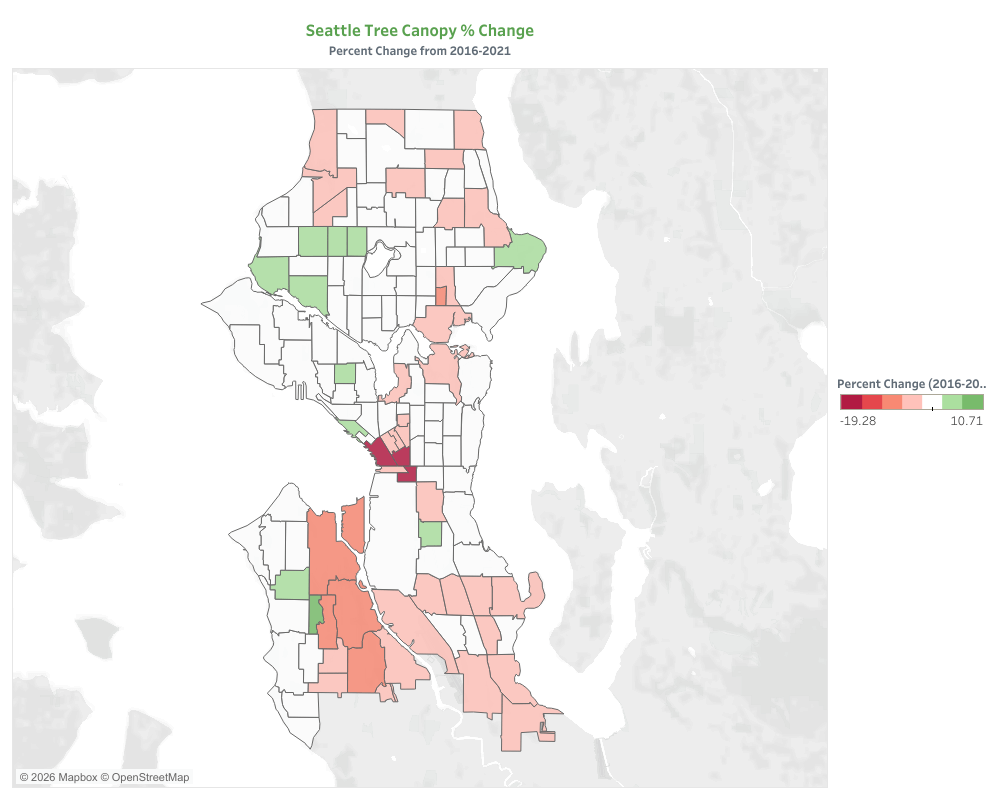
Next, we look at how Seattle’s tree canopy has changed over the five-year period from 2016 to 2021. Changes are calculated by census tract and grouped into seven categories to make the patterns easier to see.
The color scale is designed so that zero or minimal change appears white, while gains are green and losses are red. This makes increases and decreases immediately visible across the city.
Our goal is to highlight which areas are gaining or losing canopy and to track these changes alongside demographic patterns, which we explore in the following sections.
A quick glance at the map reveals a notable trend: more red than green overall. This shows a general decline in tree coverage, with Seattle losing roughly 0.4% of its canopy — about 250 acres — during this period.
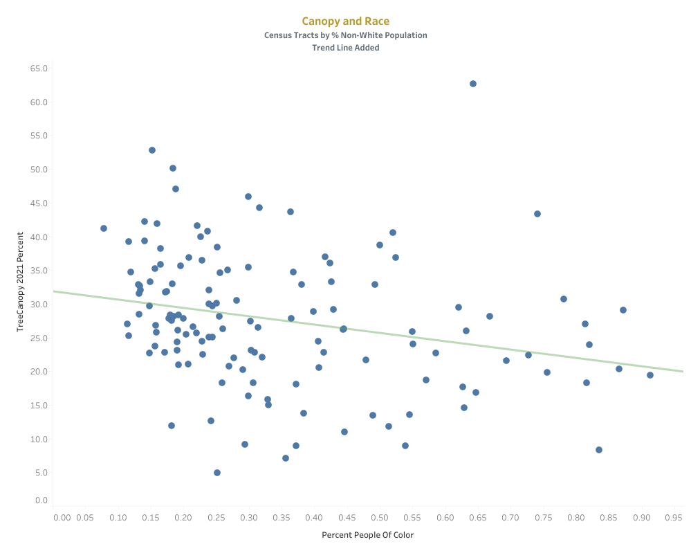
Canopy and Race
Linking US Census data with tree canopy data allows us to explore how canopy coverage varies across demographic groups. One key measure in the census is the percentage of people of color within each census tract.
Previous research has shown that communities with higher percentages of people of color tend to have significantly lower tree canopy coverage. Nationally, this gap amounts to roughly 33% less canopy compared to majority-white areas4. These disparities in environmental conditions can have meaningful consequences for health, comfort, and overall quality of life.
In Seattle, we examined this relationship by plotting the percentage of people of color against tree canopy coverage at the census-tract level. The scatterplot reveals a clear downward trend: as the proportion of non-white residents increases, average canopy coverage tends to decrease, consistent with national patterns. A linear regression fitted to the data confirms that this relationship is statistically significant (p < 0.01), though it explains only a modest portion of the overall variation (R² ≈ 0.06), suggesting that many other factors also shape canopy distribution across the city.
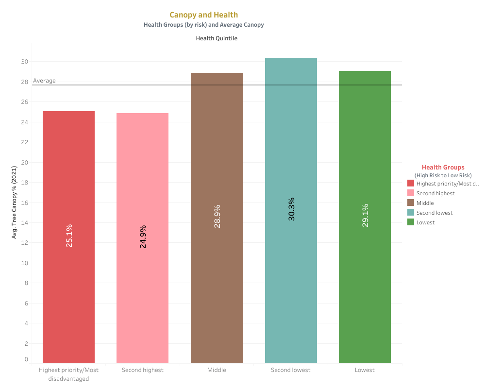
Canopy and Health
One of the key benefits of living in areas with higher tree canopy is its positive association with health2. Using US Census data, we compared population health measures across census tracts with varying levels of canopy coverage.
The health data includes prevalence of chronic conditions, general health status, and access to healthcare services. For analysis, these measures are grouped into health categories.
The bar chart below shows a clear trend: as tree canopy percentage increases, overall health indicators improve. A mean line added to the chart highlights the general upward pattern across the population.
While many factors influence health, and we cannot claim a direct causal relationship, the data aligns with expectations — higher tree canopy coverage tends to coincide with better health outcomes. This trend underscores the importance of urban green spaces for community well-being.
Final Thoughts
I would like to thank the City of Seattle for making a wealth of important datasets publicly available. Examining relevant, well-curated data can offer valuable insights and empower residents to take action or engage in more informed discussions about issues that impact our quality of life.
Reflecting on the results, I was surprised to learn that Seattle lost approximately 250 acres of tree canopy within a five-year span, and that disparities related to race and health closely mirror national trends. Anecdotally, I experience Seattle as a leafy, green city with a progressive government that prioritizes environmental stewardship and social equity.
This contrast highlights the importance of producing and analyzing data to ground decisions in evidence rather than perception. Data helps surface patterns that may not be immediately visible and allows us to identify specific areas where targeted intervention is needed.
By leveraging these insights, cities like Seattle can work toward creating a healthier, more equitable urban environment for all residents.
References
- Center for Watershed Protection. Urban Tree Canopy .
- Urban Canopy Works. Why Urban Tree Canopy Is Important for Cities .
- City of Seattle Open Data Portal. Existing Tree Canopy (%) .
- Policy Perspectives. How Racism Has Shaped the Presence of Urban Tree Cover in Public Spaces .