A comparison of reported Seattle tree canopy percentage change from 2016 to 2020 with a look at demographics from the US Census
Personal Perspective
I consider myself a city person but with a great love for nature and the idea of an urban canopy, and it’s impacts on the health and enjoyment of city life, has always been interesting to me. I began this analysis to evaluate how well my city and community are doing in this regard.
Urban Tree Canopy Definition and Importance
The urban tree canopy, defined as the layer of leaves, branches, and stems of trees that cover the ground when viewed from above[1], is not only pretty but also provides numerous benefits to the urban environment. These benefits include:
- Pollution Removal: Trees absorb pollutants such as carbon dioxide, ozone, and particulate matter, improving air quality.
- Heat Alleviation: Trees provide shade and release moisture, which helps lower temperatures in urban areas, mitigating the urban heat island effect.
- Support for Wildlife: Urban canopies offer habitats for birds, insects, and other wildlife, enhancing biodiversity.
Community and Health Benefits
In turn, these environmental benefits translate to significant health and social advantages for the community, such as[2]:
- Better Mental and Physical Health: Access to green spaces has been linked to reduced stress, improved mood, and increased physical activity.
- Increased Property Values: Properties in well-treed areas often have higher market values due to the aesthetic and environmental benefits provided by the canopy.
- Reduction in Crime: Some studies suggest that greener neighborhoods experience lower crime rates and tend to have reduced rates of less graffiti, vandalism, and litter.
A Closer Look with Data
My hometown of Seattle, Washington provides data on tree canopy changes from two time periods (2016 and 2021). The University of Vermont’s Spatial Analysis Lab (SAL) mapped these changes using remotely sensed high-resolution data. More information, a detailed description of the mapping process, and the complete dataset can be found on the City of Seattle’s website[3].
The dataset is enriched with data from the US Census, allowing us to compare canopy percentage with various demographics such as race and health conditions. This comparative analysis can shed light on how tree canopy changes might be impacting different communities and their well-being.
The City of Seattle has produced a final assessment of the data available as PDF: 2021 Tree Canopy Assessment.
Methodology
I downloaded the Excel data file and connected it to a KML file (a file format used for displaying geographic data) of Seattle. This data is broken out by census tract, providing a finer picture than neighborhood or zip code level and aligning with supporting data from the census. The dataset and KML file were combined, analyzed, and published using Tableau.
I created a dashboard in Tableau highlighting areas of interest. After validating the data, I found that census tract 246 is missing important data points and is excluded from certain views. This exclusion ensures the accuracy and reliability of the analysis.
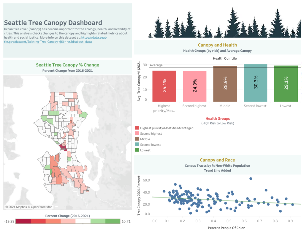
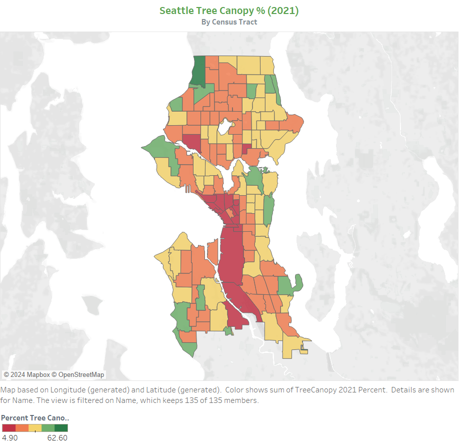
Tree Canopy Map
First, we take a look at the tree coverage from the 2021 measurement, with green indicating a large amount of coverage and red indicating very small coverage. This map provides a visual representation of the tree canopy distribution across Seattle.
The color break-out matches expectations, with the downtown core and the south-of-downtown industrial districts shown in deep red, indicating minimal tree coverage. In contrast, the green districts include areas with large parks such as Discovery Park, Seward Park, and the Washington Park Arboretum, highlighting significant tree coverage.
This map not only visualizes the current state of the tree canopy but also sets the stage for understanding the demographic impacts and changes over time.
Change in Canopy (2016 to 2021)
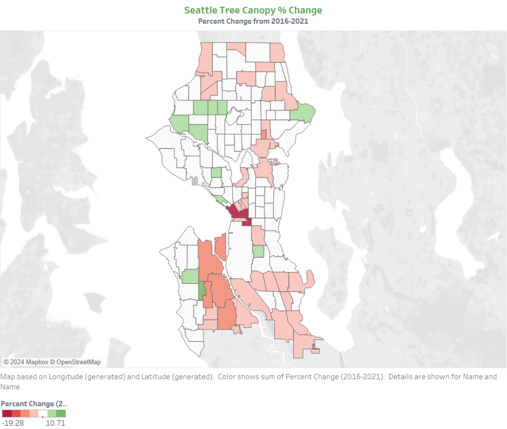
Next, we examine the change in tree canopy percentage from 2016 to 2021. The percentage changes are calculated by census tract and categorized into seven buckets to simplify the visualization and analysis.
The color scale is calibrated so that zero or little change is mapped to white, making significant increases and decreases stand out more clearly.
The goal of this analysis is to identify which areas of the city are more or less affected by changes in the tree canopy and to track these changes in relation to demographics, which we will explore in the following sections.
Interestingly, while analyzing the aggregate numbers, we see a notable trend with much more red on the map. This indicates a general decline in tree coverage, with the city as a whole losing roughly 0.4% of its canopy, equating to about 250 acres.
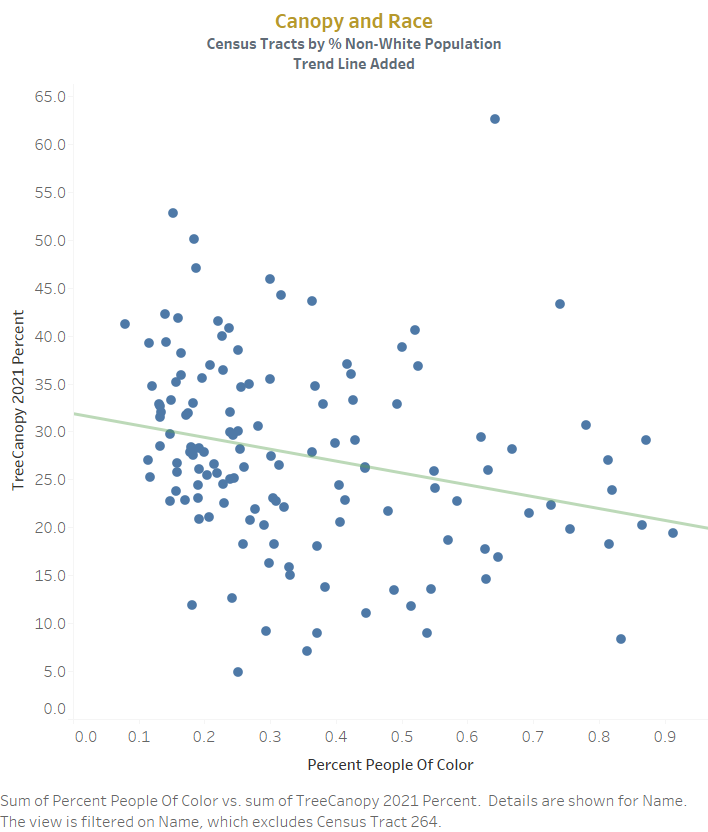
Canopy and Race
Tying the US Census data to the canopy data allows us to check for trends related to demographic factors. One key data point from the census is the “Percent People of Color” for each tract.
Research has shown that communities with a high percentage of people of color tend to have much lower tree canopy coverage. Nationwide, the gap is about 33% less tree coverage compared to majority white areas[4]. This disparity in environmental quality can have significant impacts on health and quality of life.
Using a scatter graph, we plotted the percentage of people of color against tree canopy coverage for Seattle. The graph shows a clear decline in canopy coverage as the percentage of non-white residents increases, which aligns with national trends. A trend line added to the graph has a P-value of 0.0031522, indicating a statistically significant relationship between these variables.
Canopy and Health
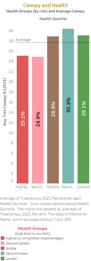
A pronounced benefit of living in an area with a high percentage of tree canopy is its positive impact on health[2]. In our next graph, using US Census data, we compare the relative health of the population to the percentage of tree canopy.
Health data from the census includes various measures such as the prevalence of chronic conditions, general health status, and access to healthcare services. These measures are grouped into health categories for analysis.
The graph shows that in Seattle, as the percentage of tree canopy increases, the healthiness of the residents also increases significantly. The results are bucketed by health groups as defined by the census.
There are complex factors involved in this relationship, and while we cannot claim a direct causal link, the data aligns with our expectation that higher tree canopy coverage is associated with better health outcomes. This trend underscores the importance of urban green spaces for community well-being.
Final Thoughts
I would like to thank the City of Seattle for providing a wealth of important data sets to the public. Examining relevant and useful data can offer valuable insights and empower us to take action or engage in informed discussions about issues impacting our quality of life.
…the city as a whole losing roughly 0.4% of its canopy, equating to about 250 acres.
Reflecting on the data, I was quite surprised to learn that Seattle has lost 250 acres of tree canopy within a five-year span and that the disparities related to race and health align with national trends. Anecdotally, I experience the city as leafy and green, with a progressive-minded government that prioritizes environmental and social justice issues.
This underscores the importance of producing and analyzing data to ensure our decisions are based on facts rather than anecdotes. It helps us identify specific areas of difficulty and take targeted actions to address them.
By leveraging this data, we can work towards creating a healthier and more equitable urban environment for all residents.